A small business owner in Pune recently invested in a desktop-focused website. The design looked sharp on a 24‑inch monitor, but when customers tried to book services from their phones—more than 60% of its traffic—buttons overlapped, text required constant zooming, and the checkout form failed repeatedly. The business lost leads for three months before understanding the problem: the site was not built for the devices its customers actually used.
In India, where mobile internet users exceed 800 million and mobile accounts for roughly three‑quarters of all web traffic, responsive web development is not a technical nicety. It is a business necessity. Yet many companies still treat mobile compatibility as an afterthought—adding a “mobile version” or shrinking a desktop layout rather than embracing a true responsive approach.
This article explains what responsive web development means specifically for Indian mobile users, how it differs from other mobile strategies, and what businesses gain when development prioritises the real‑world constraints of Indian networks, devices, and user behaviour.
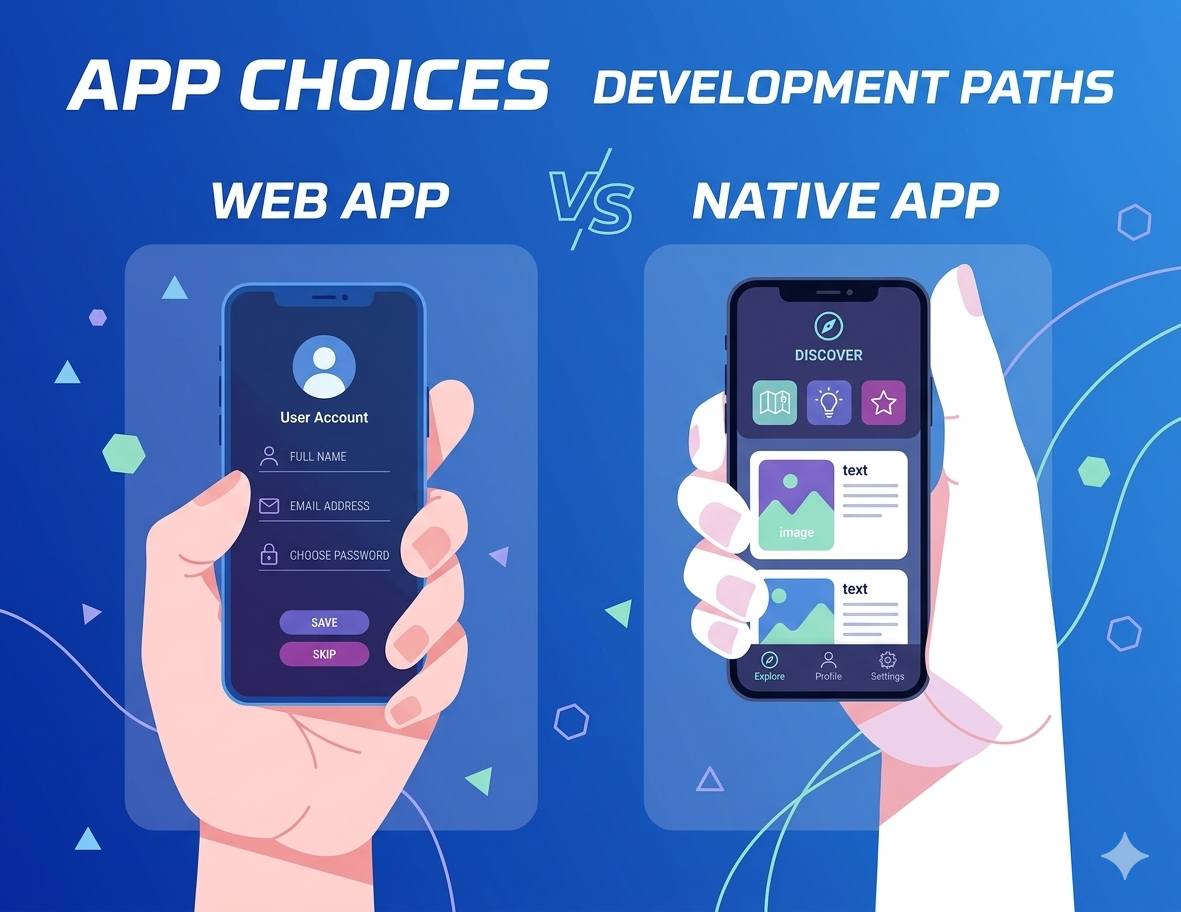
Many business owners assume any website that loads on a phone is “mobile friendly.” Responsive web development goes further. A genuinely responsive site uses fluid grids, flexible images, and CSS media queries to adapt layout, navigation, and content to any screen size—from a ₹6,000 smartphone to a high‑resolution tablet.
For an Indian user, this means:
The difference between a responsive site and a separate “mobile site” is also significant. Mobile‑only versions often strip features or content, forcing users to switch to the desktop view for certain actions. Responsive development maintains the same content and functionality across devices—just presented appropriately.
Understanding why responsive web development matters in India requires looking at how people actually use the internet.
Network variability. An Indian mobile user might experience 4G in a city centre, drop to 3G on a train, and fall back to 2G in a rural area. A responsive site that loads heavy desktop assets on all devices will fail in low‑bandwidth conditions. Proper responsive development includes conditional loading—serving appropriately sized images and deferring non‑critical scripts based on network quality.
Device diversity. India has one of the most fragmented device markets globally. Screen sizes range from 4‑inch budget phones to 7‑inch phablets, with varying pixel densities. Responsive development tested only on flagship iPhones or Samsung devices will miss issues on Realme, Xiaomi, or Vivo models that dominate the market.
Data sensitivity. Many users still pay per megabyte. A desktop‑first site that downloads 3–5 MB on mobile costs the user real money. Responsive development that optimises asset delivery—using WebP images, lazy loading, and compressed CSS/JS—reduces data consumption and respects the user’s budget.
Mobile‑first usage patterns. Unlike Western markets where desktop usage remains significant, many Indian users access the internet exclusively through mobile devices. They never see the desktop version. If a business’s responsive implementation is incomplete, those users experience a broken site—no fallback exists.
For Indian businesses, the impact of responsive web development appears directly in measurable outcomes.
Search rankings. Google uses mobile‑first indexing, meaning it evaluates the mobile version of a site for ranking. A site that is not fully responsive will rank lower in search results, regardless of desktop quality. This affects visibility for businesses competing in local SEO, e‑commerce, or service categories.
Bounce rates. Indian mobile users abandon sites that take longer than three seconds to load or require zooming to read text. Responsive development that prioritises speed and readability reduces bounce rates and increases time on site.
Conversion rates. An e‑commerce site with a responsive checkout that works seamlessly on mobile—including address auto‑fill, one‑tap payment options, and clear error messaging—will convert at significantly higher rates than a desktop site squeezed onto a phone screen.
Customer trust. A site that looks broken on a user’s device signals neglect. In markets where trust is a competitive advantage, responsive development communicates professionalism and reliability.
“My customers mostly use desktop.” Data from analytics often shows desktop as the primary source because the current site is unusable on mobile. Once a responsive version launches, mobile traffic typically increases substantially.
“A mobile plugin is enough.” Many WordPress plugins claim to add mobile responsiveness. They often generate separate mobile URLs or apply generic transformations that break specific features. Genuine responsive web development requires theme‑level integration, not a plugin patch.
“Responsive development is expensive.” Building responsive from the start adds 15–30% to development costs compared to a desktop‑only build. Retrofitting responsiveness to an existing desktop site can cost 50–100% more. The upfront investment is lower than the cost of lost mobile traffic.
“We have an app, so the website doesn’t need to be mobile friendly.” Most users will not download an app for a business they visit occasionally. The mobile website remains the primary entry point. A poor mobile web experience drives users to competitors, not to the app store.
When evaluating responsive web development services, specific technical elements directly affect the user experience.
Viewport configuration. Proper meta viewport settings ensure the site scales correctly on any device. Incorrect configuration forces users to zoom or results in tiny text.
Breakpoint strategy. Responsive design uses breakpoints—screen widths where layout changes. A developer familiar with Indian device data will set breakpoints at common resolutions (360px, 414px, 720px, 768px) rather than default Western sizes.
Image optimisation with srcset. Using srcset attributes allows the browser to choose the correct image size based on screen resolution and network speed. This prevents a 4‑inch phone from downloading a 2000‑pixel desktop image.
Touch event handling. Mobile users tap, not click. Responsive development includes touch‑friendly hover alternatives, prevents 300ms tap delays, and ensures interactive elements respond to touch events.
Form input types. Using type="tel" for phone numbers or type="email" for email addresses triggers the appropriate mobile keyboard, reducing user friction. Small details that improve conversion.
For businesses in India, responsive web development pricing reflects the local market.
These ranges apply to independent developers and small firms. Agencies charge 2–3x higher. The key is verifying that “responsive” in the proposal means thorough testing on actual Indian device types, not just browser resizing.
Before signing a development agreement, ask for:
A developer who cannot provide these may not have a rigorous responsive process
Over several years of building websites for Indian businesses, I have watched the same scenario repeat: a client insists on a desktop-first design because “mobile users can just zoom.” Then analytics come in showing 70% mobile traffic and a 90% bounce rate. The conversion conversation changes quickly.
The hardest truth to communicate is that responsive web development is not about adding a feature. It is about rethinking how content is structured. A desktop layout that places three columns side by side becomes a vertical stack on mobile. That changes the user journey. A call-to-action button buried in the bottom right corner on desktop becomes unreachable on mobile unless navigation is redesigned. These are not technical fixes—they are design decisions.
Another observation specific to India: regional language support interacts with responsiveness. Many Indian businesses want to serve content in Hindi, Tamil, or Telugu. Non-responsive themes often break with script rendering or line heights. Testing with actual Indic scripts on mobile devices is essential but frequently skipped.
The most successful projects I have seen treat responsive development as the default, not an add-on. From the first wireframe, the mobile layout is designed, and desktop is expanded from there. This “mobile-first” approach consistently produces faster, more usable sites than trying to squeeze a desktop design onto a phone.
Finally, a practical note: Indian mobile users are remarkably forgiving of small imperfections—but they are ruthless with slow load times. Every 100ms of improvement on mobile load speed directly correlates with higher engagement. Investing in performance optimisation during responsive development delivers returns that far exceed the cost.
What is responsive web development, and how is it different from mobile-friendly?
Responsive web development uses fluid grids and CSS media queries to adapt a single website layout to any screen size. “Mobile-friendly” is a broader term that can include separate mobile sites or basic viewport settings. Responsive ensures the same HTML and content serve all devices, with layout adjustments based on screen width, not user agent detection.
Why does responsive web development matter more in India than in other markets?
India has over 800 million mobile internet users, and mobile accounts for 70–80% of web traffic. Network conditions vary widely, and device diversity is extreme. A responsive site that loads quickly on a budget phone over 3G is essential for reaching the majority of users. In markets with higher desktop usage, a non-responsive site might still function; in India, it will fail.
How much does responsive web development cost for a small Indian business?
For a standard business website (5–15 pages) built responsively from scratch, costs range from ₹50,000 to ₹1,50,000 from independent developers. Retrofitting responsiveness to an existing desktop site typically costs ₹20,000–₹50,000 but may produce lower quality than a fresh build. These prices exclude hosting, domain, and ongoing maintenance.
Will responsive development slow down my site?
Properly implemented responsive development can improve performance because it enables conditional loading of assets. Problems arise when developers add heavy frameworks or fail to optimise images. A well-built responsive site loads faster on mobile than a desktop site forced onto a small screen, because it serves only necessary resources.
Do I need a separate mobile app if my site is responsive?
Not for most businesses. A responsive website works for all users without installation, updates, or app store approval. Apps are useful for functionality that the web cannot easily replicate (push notifications, device sensors, offline access) or for businesses with high repeat engagement. For informational or e-commerce sites, a responsive website is usually sufficient.
What role does responsive development play in local SEO for Indian businesses?
Google’s mobile-first indexing means the mobile version of your site determines your search ranking. A non-responsive site will rank lower for local searches (e.g., “plumber in Delhi” or “cafe near me”). Responsive development directly affects visibility in Google Maps and local pack results, which are predominantly viewed on mobile devices.


Online • Typically replies in minutes